
If you work as a web designer, mastering web design color theory can greatly enhance your creativity and productivity. Because color plays a central role in shaping a website’s look and feel, understanding how different hues interact helps you choose combinations that best reflect your brand identity.
Since color choices directly influence user perception and engagement, learning color theory and web design becomes essential for creating visually cohesive and emotionally resonant experiences. Let’s explore the fundamentals and discover how to apply color theory that can elevate your web design projects.
Key Takeaways:
Color isn’t just decoration; it’s a key part of user experience. A solid grasp of web design color theory allows designers to craft digital interfaces that guide attention, evoke emotion, and strengthen brand identity.

Color theory provides the scientific foundation for understanding how colors interact, complement, and contrast with each other in digital environments.
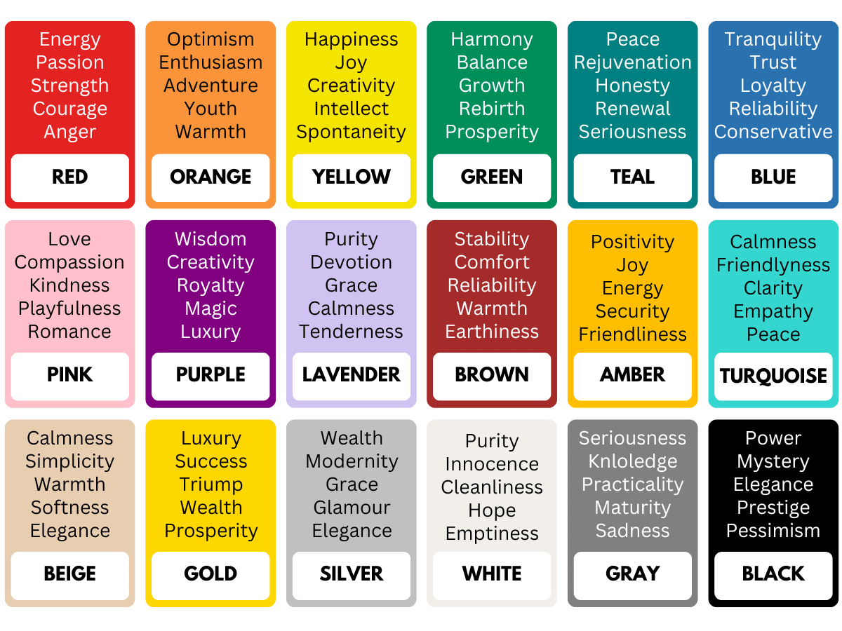
In this theory, the traditional color wheel consists of primary colors (red, blue, yellow), secondary colors (orange, green, purple), and tertiary colors created through various combinations.
To put them into perspective, here is how each color category plays its role:
Apart from the traditional color wheel in web design color theory, there are other color theories designers can implement:
Also Read : Anatomy of Typography: A Complete Guide to Learn Typography
Color psychology explores how different hues influence human emotions, behaviors, and decision-making processes throughout website interactions.
For example, red colors evoke urgency, passion, and excitement (making them effective for sales promotions and immediate action requirements), while blue colors convey trust, reliability, and professionalism (perfect for financial institutions and corporate websites).
Understanding color theory is one thing; using it effectively is another. Let’s explore how to craft a color palette that connects design principles with real-world branding goals.
Creating an effective color palette begins with understanding your brand identity and target audience. Designers should analyze how colors reflect brand values and how they influence user perception. This ensures every color choice aligns with business objectives and strengthens visual communication.
A well-known guideline in web design color theory is the 60-30-10 rule, which distributes color use as follows:
Each color should serve a clear purpose. Background colors form the site’s mood and readability, so use soft, neutral shades like light gray or off-white to keep content easy to read. Meanwhile, secondary colors should complement the primary palette to maintain brand identity and provide flexibility across layouts.
For buttons and calls-to-action, color can guide user behavior. Warm tones such as red or orange create urgency, while cooler hues like blue or green evoke calmness and trust. Using contrasting or complementary color relationships helps these elements stand out while preserving harmony.
Lastly, ensure typography colors have a strong contrast for comfortable readability across all devices.

Modern color management systems help designers maintain consistency across different devices and environments. The RGB color model provides a reliable digital standard for defining and communicating color values between designers and developers.
For inspiration and efficiency, tools such as Adobe Color, Coolors, and Material Design can help designers explore harmonious color combinations based on color theory principles and psychological research.
Also Read : Leading, Kerning, and Tracking: 3 Key Elements in Typography

To help with determining whether your implementation of web design color theory is successful or not, here are some tests to do:

Staying updated with color trends helps designers keep their work fresh and relevant. For example, Pantone’s 2025 Color of the Year, Mocha Mousse, features warm brown tones that evoke stability, comfort, and approachability, making it versatile across various industries.
Apart from the individual colors, the way such trending colors are used should also be taken into account, with these applications being some examples:
Also Read : 8 Web Design Concepts: Important Knowledge for Designers
Color theory in web design also supports brand consistency, helping create a unified look that builds recognition and trust. Website colors should match other brand materials, like logos, packaging, and marketing assets, to ensure a cohesive identity.
A clear example is Facebook’s blue color scheme, which builds user trust and strengthens brand recognition. Its consistent use of blue across all features shows how thoughtful color application can enhance usability and brand identity.
Also Read : 20 Web Design Trends for 2026 Shaping the Digital World
Mastering web design color theory helps designers create engaging digital experiences. To elevate your visuals even further, pair your color choices with high-quality fonts from Zarma Type! Famed in the industry, it’s the go-to choice for web designers looking to bring their website to new heights.